Iterate: Ten Lessons on Design & Failure
Iterate: Ten Lessons on Design & Failure
Visualizations of unique iterative process of ten creatives.
Visualizations of unique iterative process of ten creatives.
Role: Visual Designer
Team: John Sharp & Colleen Macklin (Authors), Carla Molins (Diagrams), Nana Chen (Illustrations), Steven Davis (Illustrations), Tuba Ozkan (Diagrams)
Role | Visual Designer
Team | John Sharp & Colleen Macklin (Authors), Carla Molins (Diagrams), Nana Chen (Illustrations), Steven Davis (Illustrations), Tuba Ozkan (Diagrams)
Background
The book deals with "success" and "failure" as an integral part of the creative process. It reveals and analyzes the creative process of the ten different individuals who express their creativity in various ways and forms.
Over the three months, as a team of four, we worked with the authors of the book for finding out the purest visuals in the intersections of their own thoughts and the thoughts of the creatives they have been discussing in the book.
My Contribution
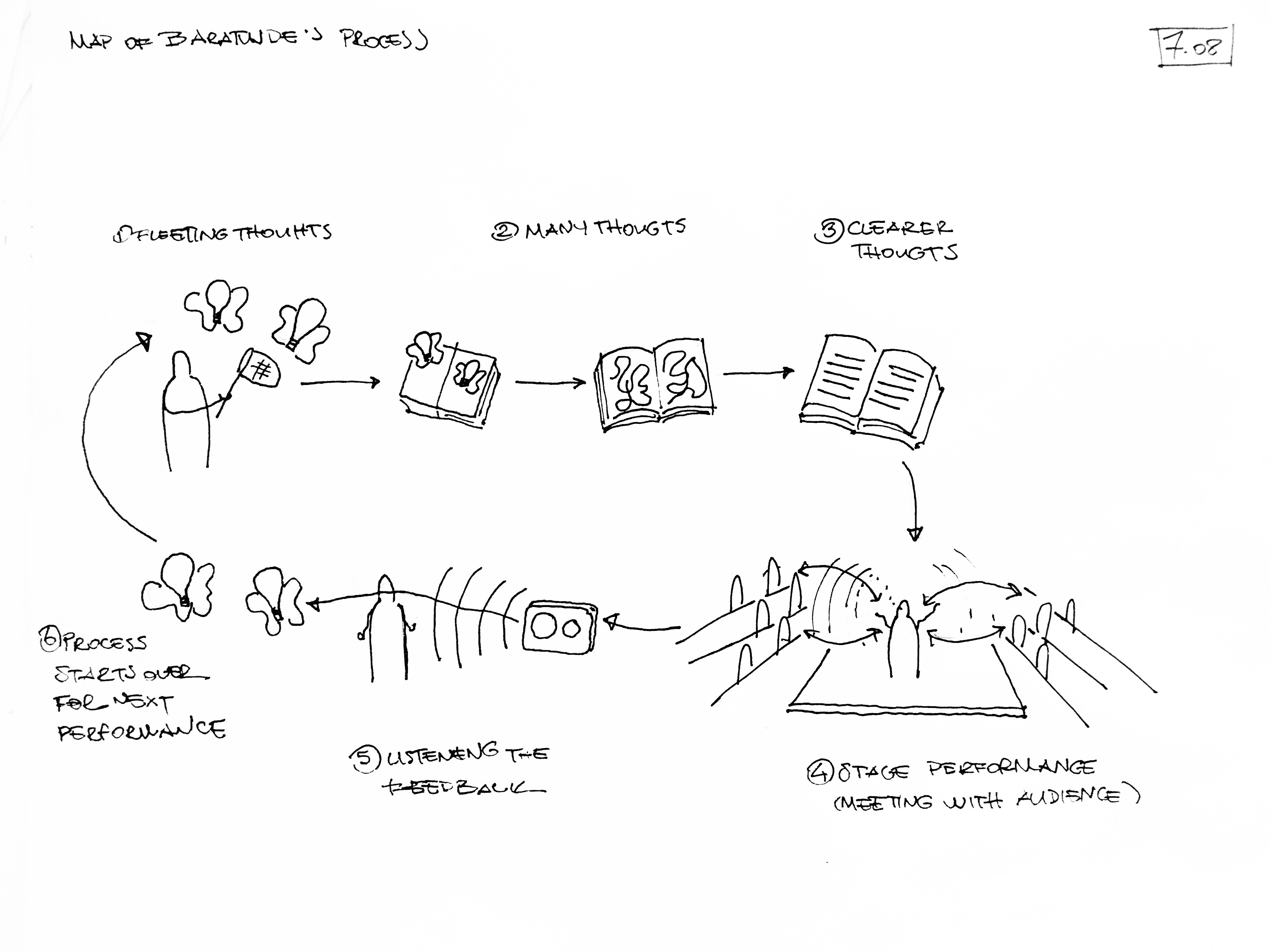
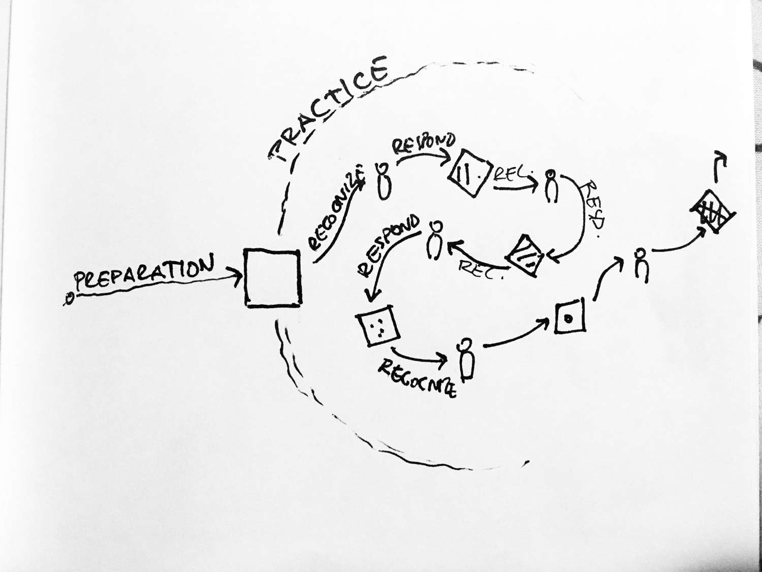
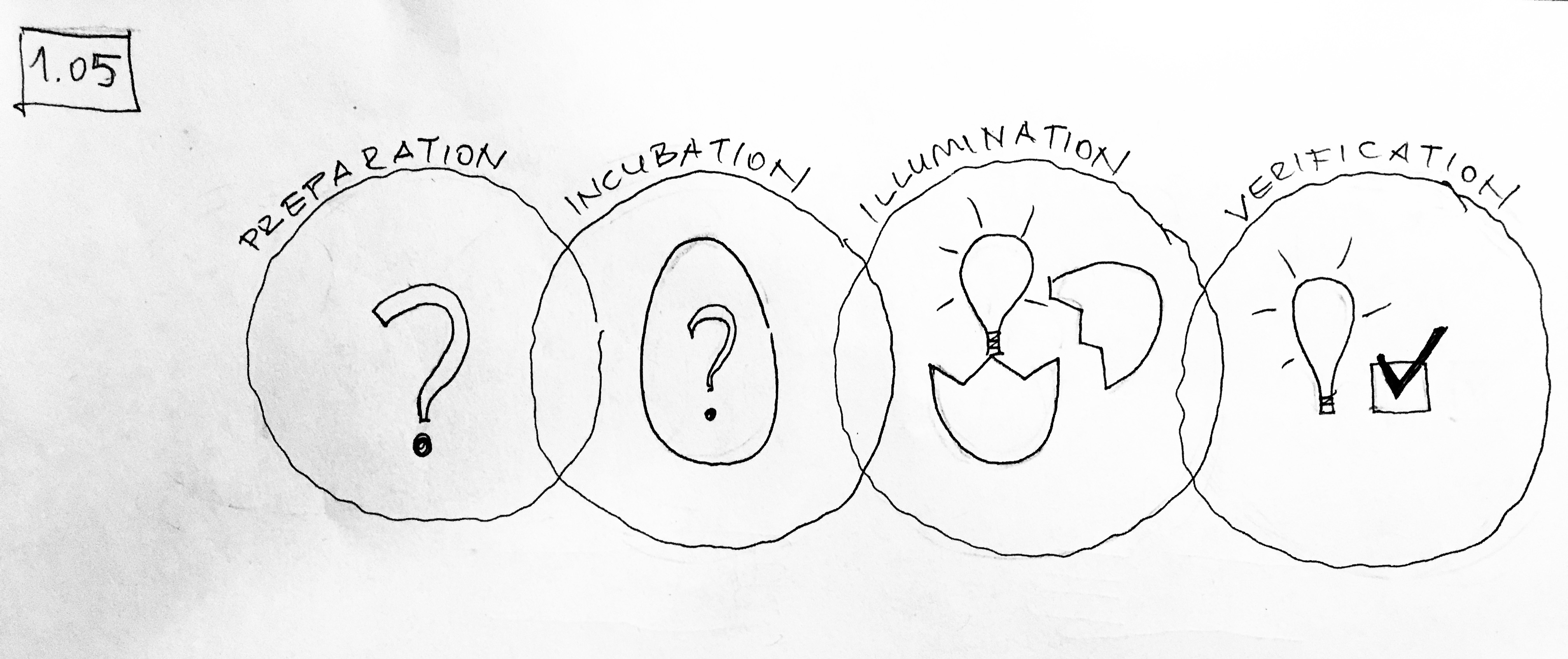
I was involved in the visualization process from early conceptual explorations to execution. While Authors were still working on finalizing content and structuring the book, I started reading each section dedicated to one creative person and analyzed their creative process. Then, I sketched out initial ideas to visualize their unique progress. I would bring these sketches to the team meetings and review them with another designer and both authors.
Once we locked the concepts and the rough designs of diagrams on paper, I moved them into illustrator and set visual standards for execution.
Research
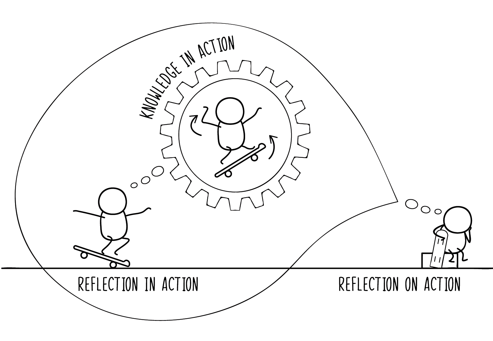
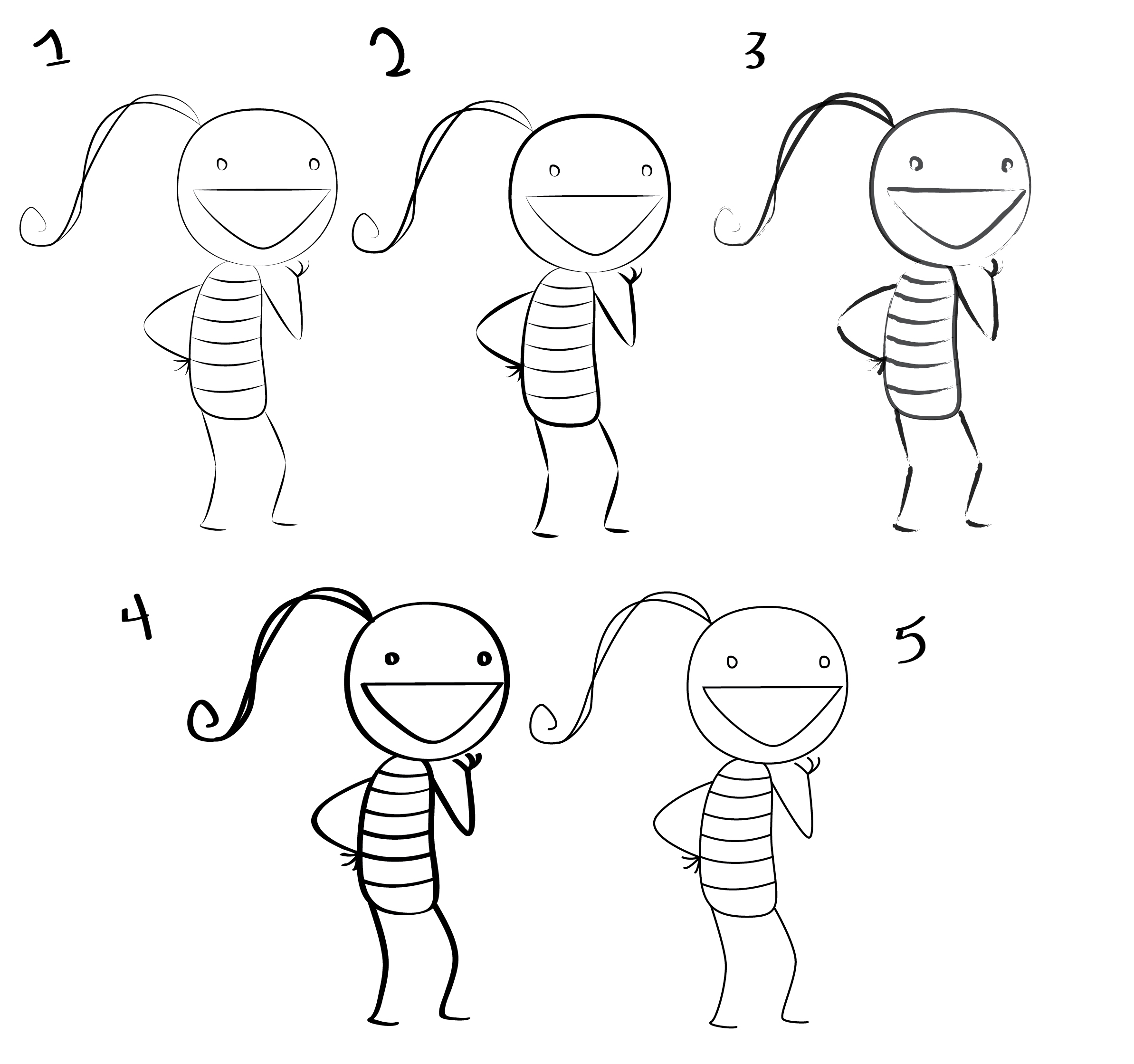
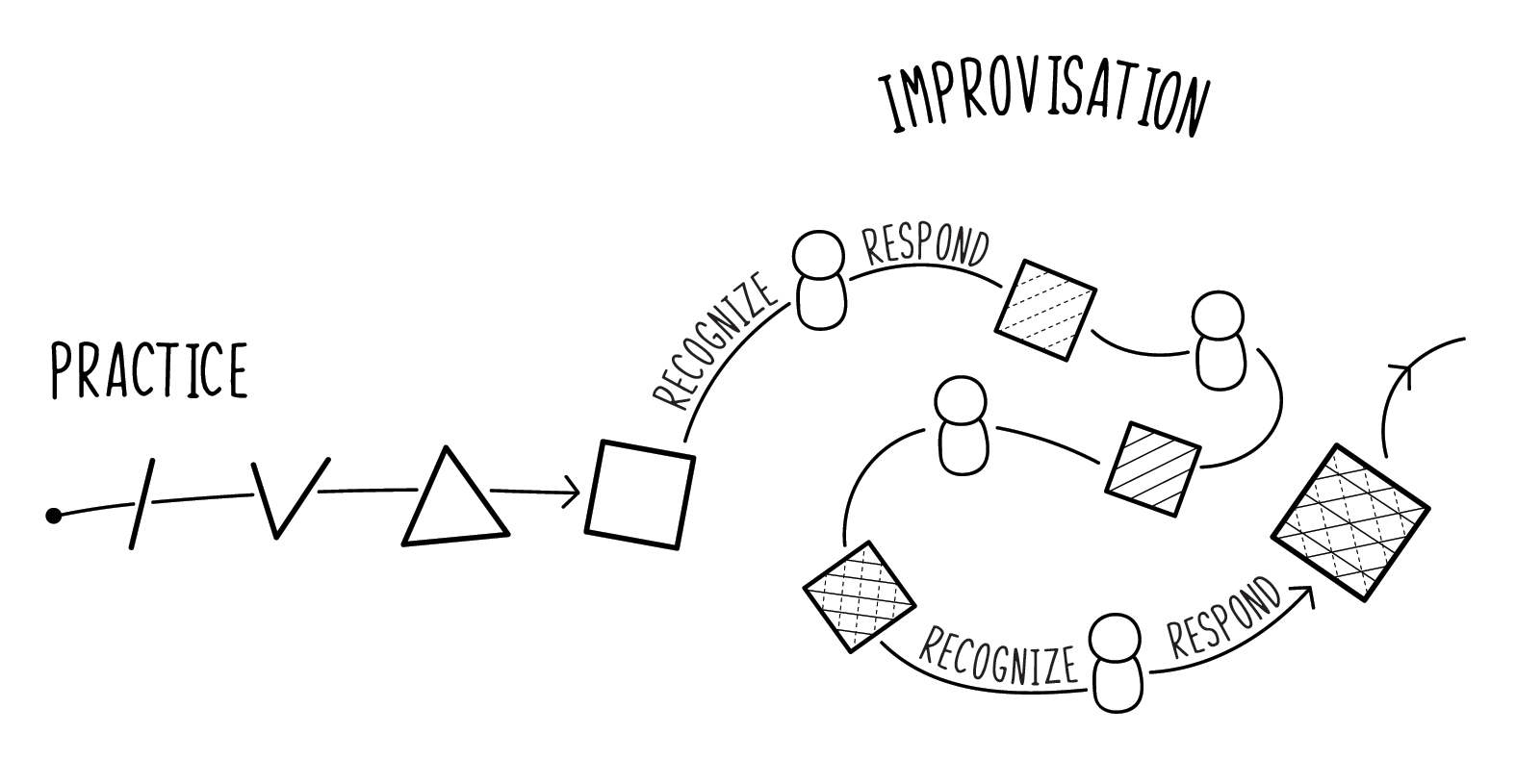
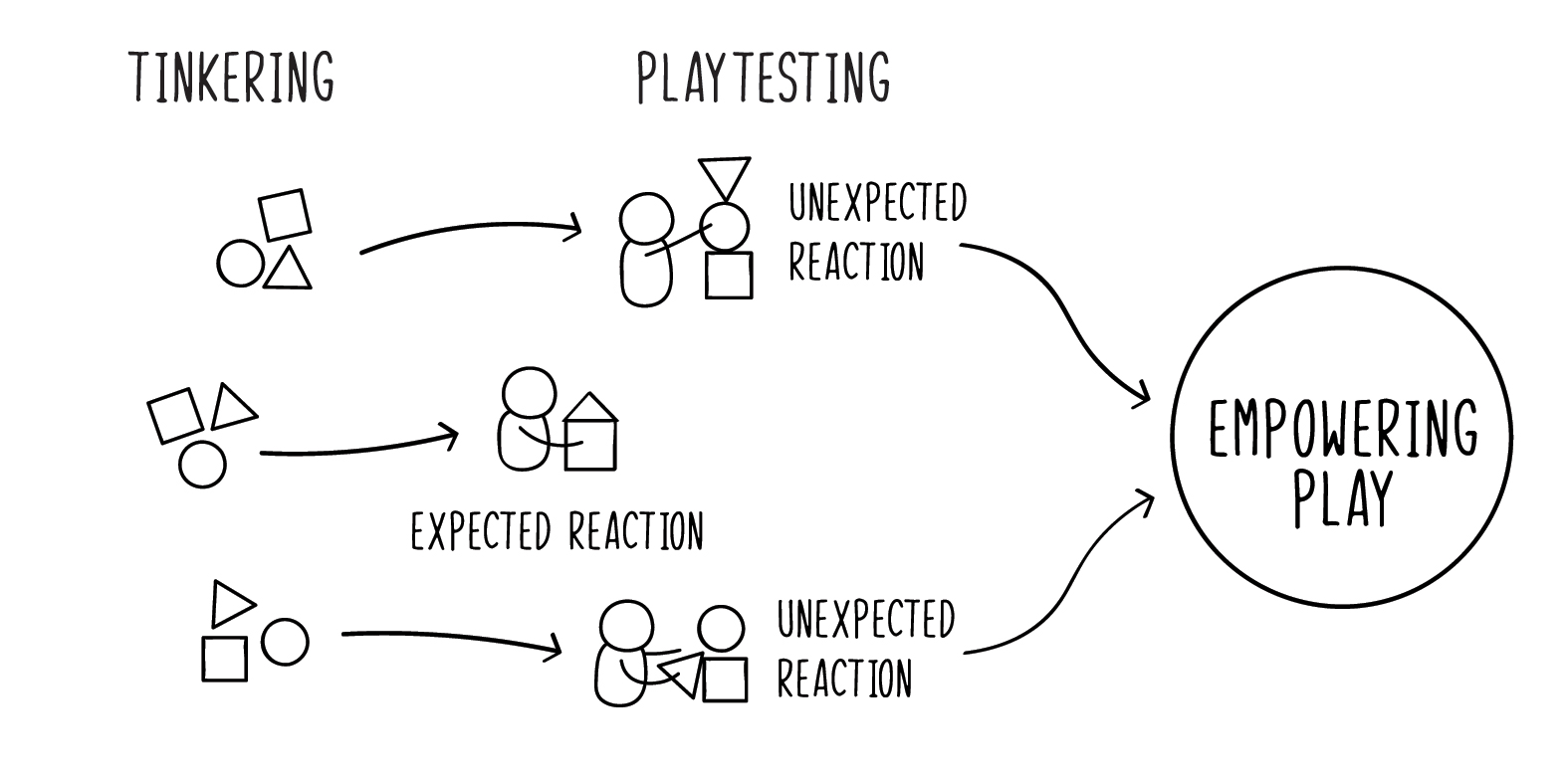
Through this iterative process, we decided to categorize visuals in two different groups: illustrations and diagrams. While diagrams help to outline and conceptualize the key ideas in every chapter, illustrations zoom in very specific details of creative processes and represent those details by using humoristic metaphorical stories. Moodboard below shows some of the visuals inspired the style of diagrams.

Early Ideation
For the first few weeks, we read the book chapter by chapter, sketched out the concepts individually, and discussed our ideas as a group during weekly meetings. By reading, sketching, and exchanging ideas, we were understanding better not only the authors' point of view but also the essence of creative processes described in the book.





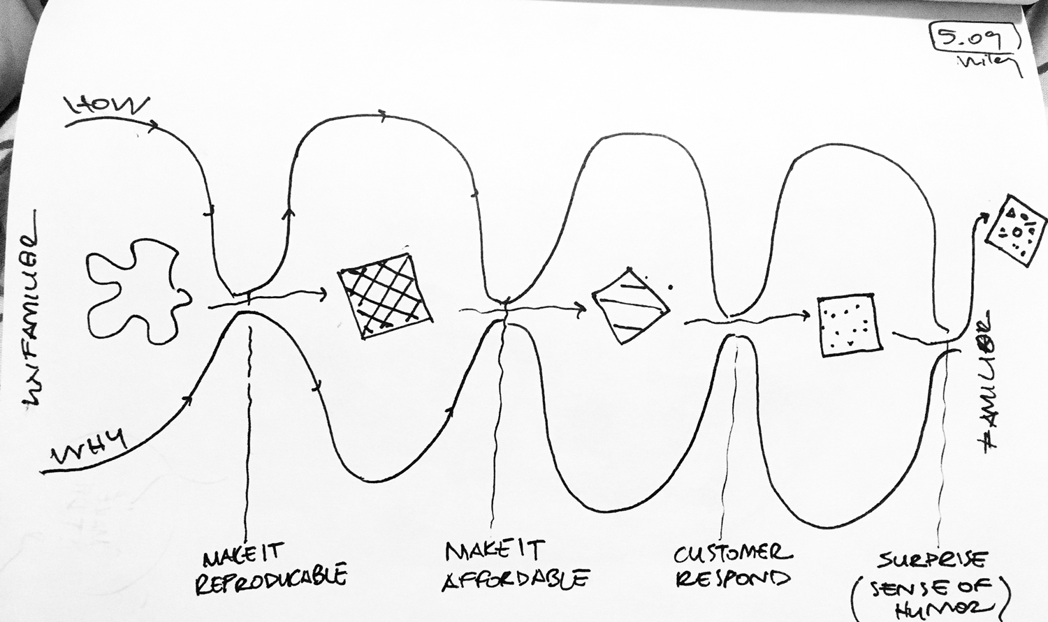
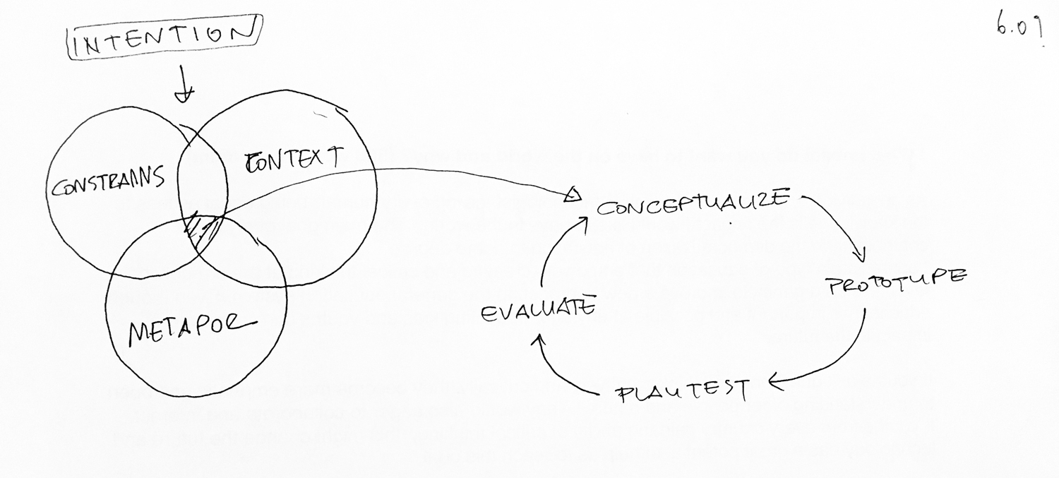
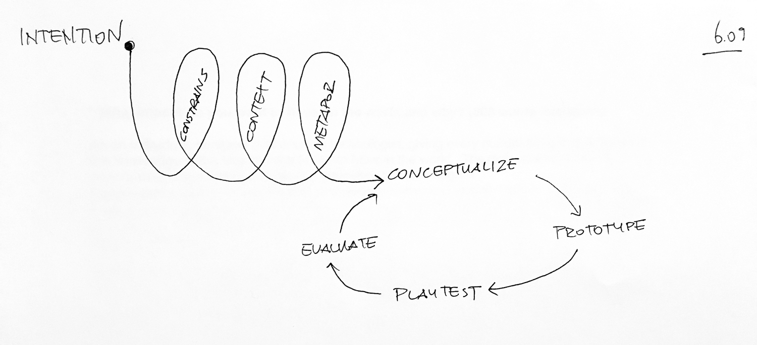

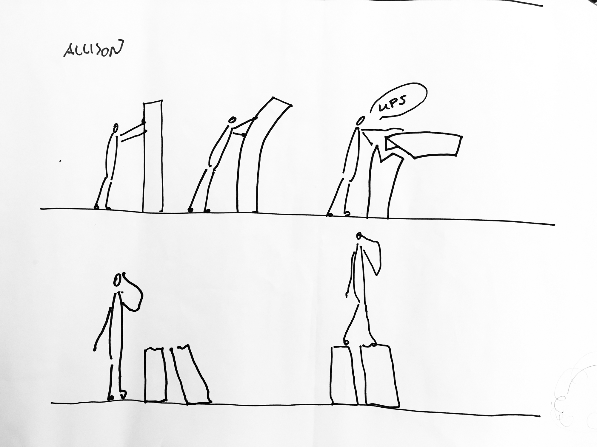

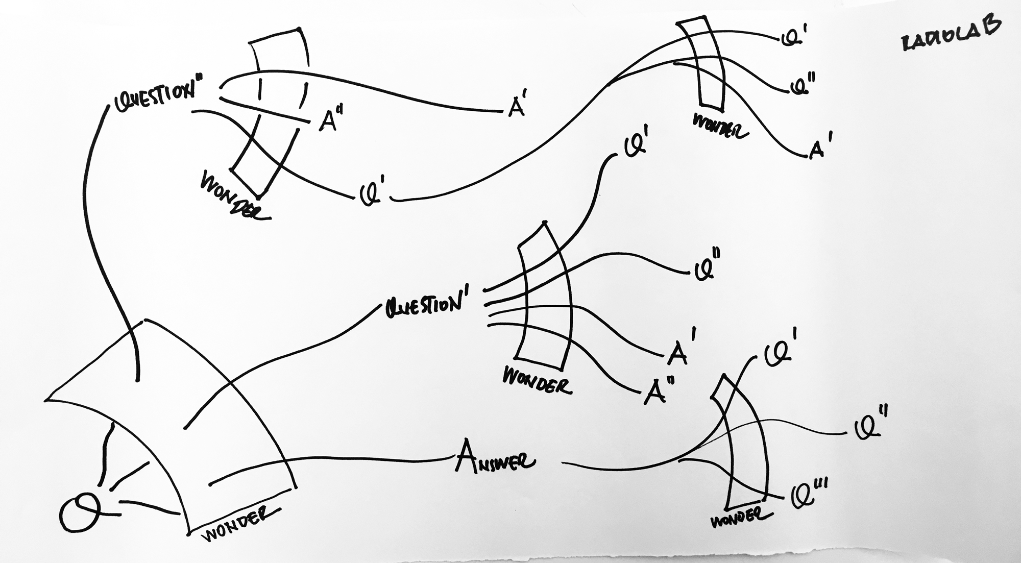


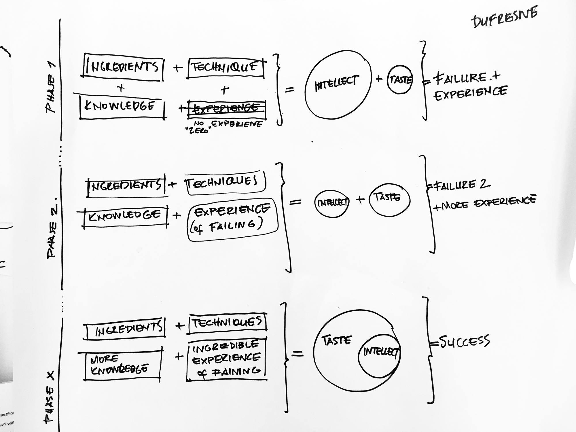

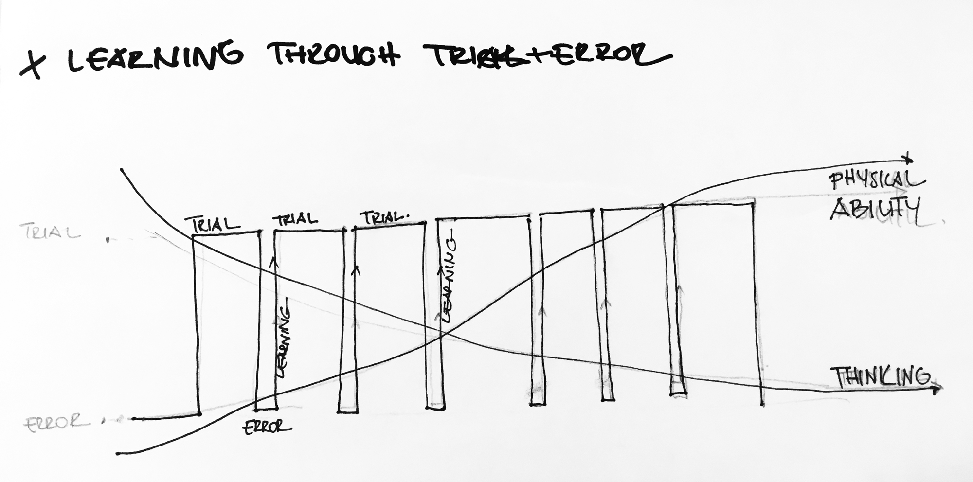
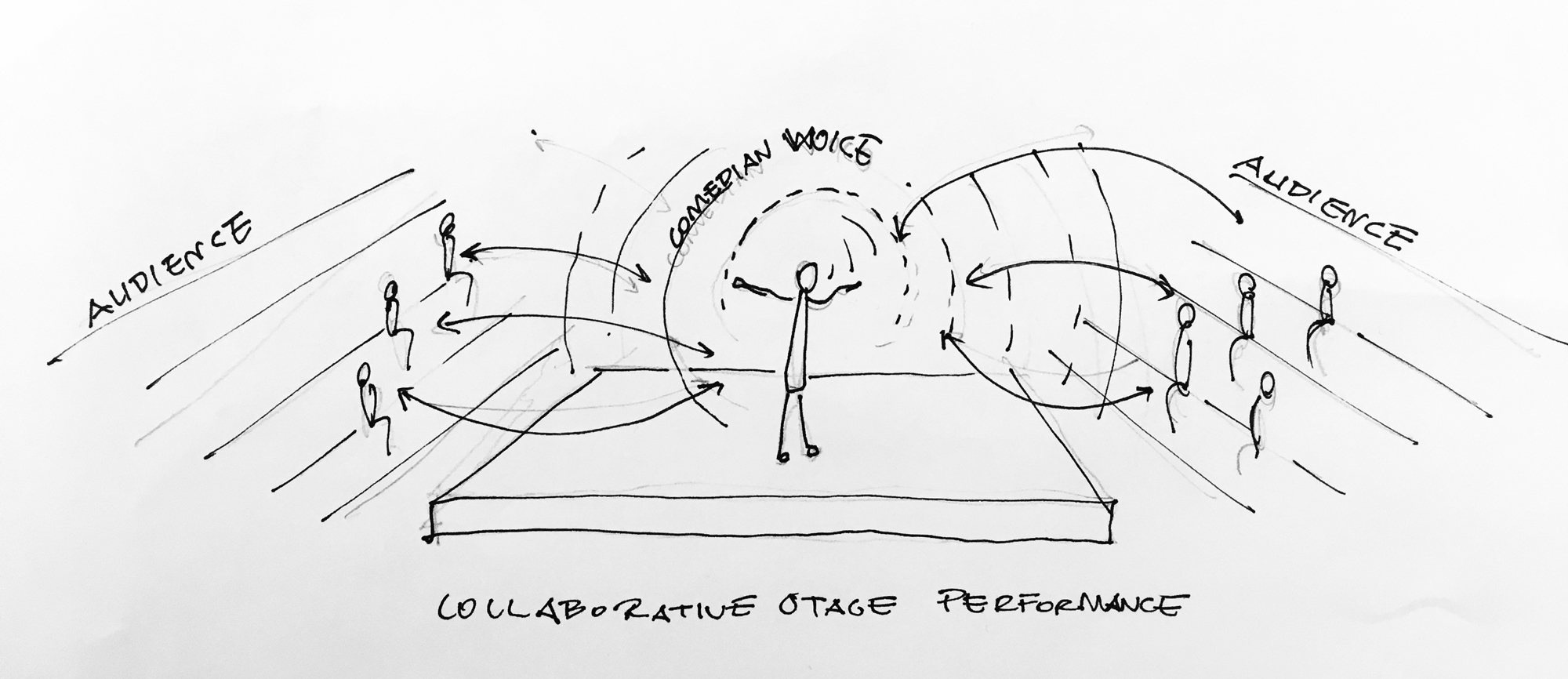


Realigning Visual Styles
As we all started moving into illustrator, we noticed that each of our visuals started looking slightly different. So we decided to set a few rules for ourselves to keep both illustrations and diagrams consistent.
1. The main thickness of lines will be 1pt (for details and traces 0.5, if really needed 0.3 min)
2. Brush Style: Brushes > Artictic_Calligraphic > 1pt. Round Brush

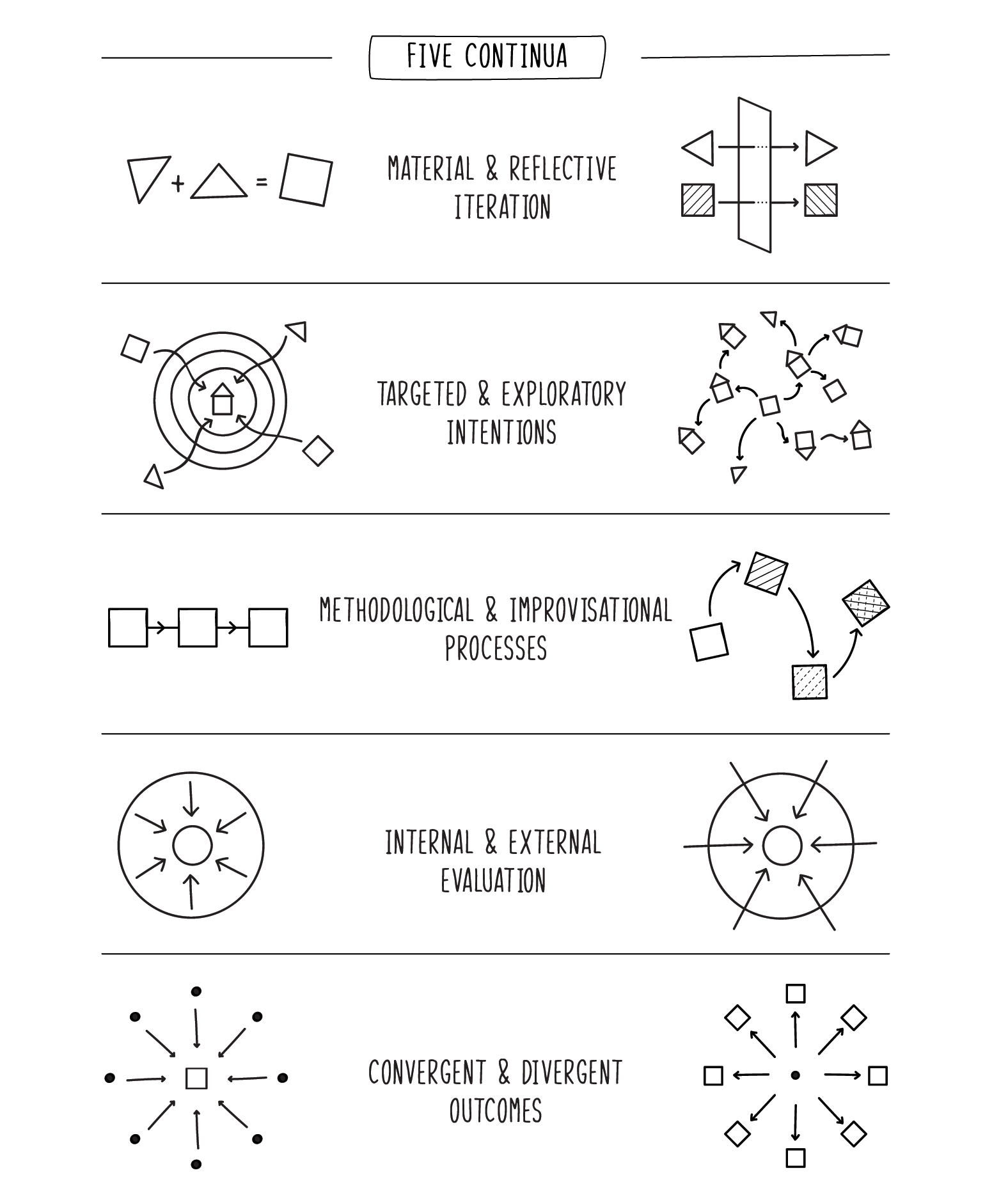
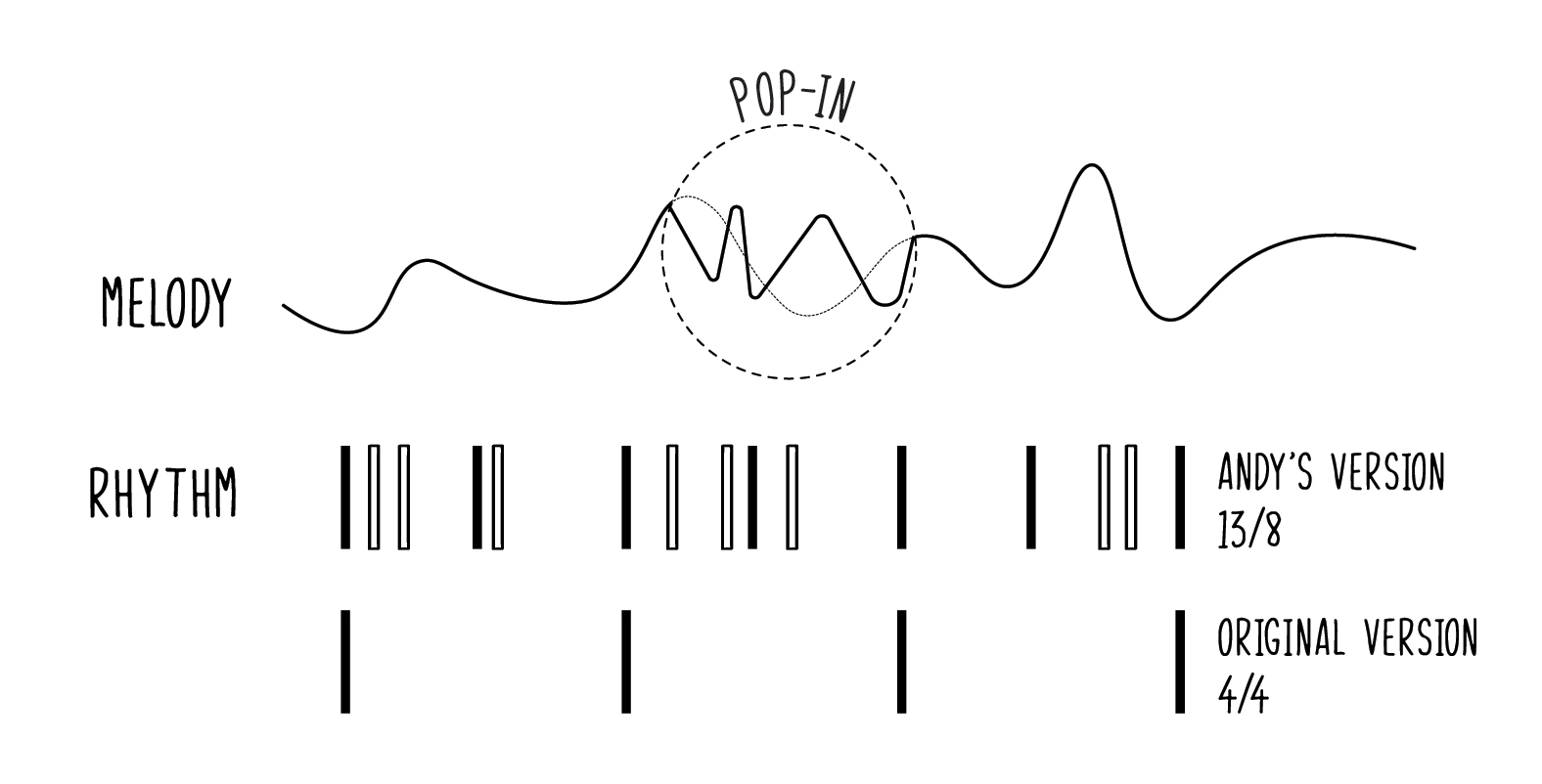
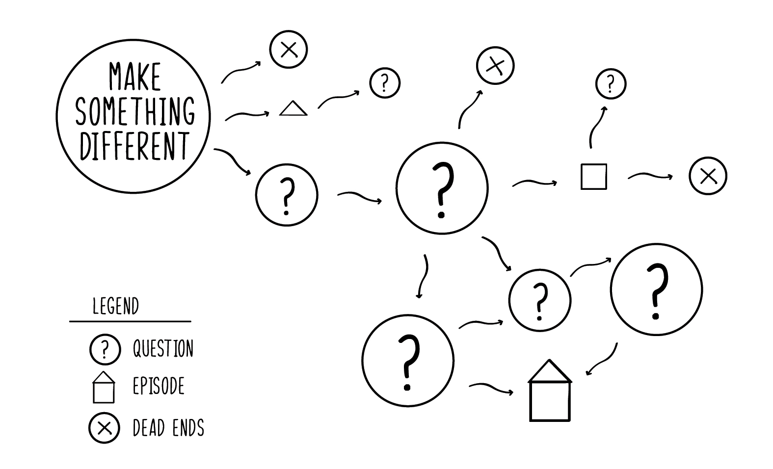
Final Diagrams










I work at the intersection of product, research & strategy, bringing a heavy sense of system thinking to my digital work. Currently based in New York, designing solutions at Squarespace to help people build and grow their business.
© 2022 Tuba Ozkan All Rights Reserved