A multiplayer augmented reality escape room experience
An automated and personalized video editing experience for small business owners.
Role: UX Designer, Art Director
Duration: 5 Months (Part-Time)
Team: Tuba Ozkan (Product Designer), Chao Hui Tu (Creative Technologist), Nestor Nieves (Director of Product at A+E Networks)
Background
ESC is a multiplayer augmented reality (AR) escape room experience themed around a History Channel drama series, Project Blue Book. The show, so the experience is based on top-secret investigations into UFOs conducted by the United States Air Force from 1952 to 1969.
The project has granted $15K by A+E Networks and planned to be used as part of the show’s promotional campaign. We showcased the product at the 2019 NYC Media Lab Demo Day.
My Contribution
Because we were only a team of two, I contributed to all phases of this project, from concept development to design & build phases. Once we had the concept flashed out, I took on the experience design while Chao (other IC in the team) worked on technical prototypes with ARKit. I iterativelly created user flows and storyboards to discuss the overall experience, interaction design, and puzzle designs with other stakeholders in our weekly meetings. I built all 3D models needed for a complete user experience. We defined the art direction of the project as a team by reviewing my suggestions and explorations and I applied the decisions to the final project assets.
PROBLEM
How might we design an immersive augmented reality escape room experience that encourages collaboration between participants during the game-play?

Why Multi-User AR Escape Room?
Collaborative
The combination of physical and digital experience enables unique interactions between players & encourages social interactions.
Highly adaptable
Multi-user AR experience can be utilized within many different themes (e.g. different types of shows, from sci-fi to horror). It makes the concept scalable.
Marketing value
It can extend the passive viewing experience to an exciting interactive engagement. Innovative media attracts millennials and Generation Z. Sharing the experience on social media increases engagement and reach.
Goals & Constraints
1. Use game-play characteristics of a physical escape room experience
2. Encourage collaboration between players
3. Use narrative & aesthetic elements from Project Blue Book
4. Make it fun to play together
5. Limit final experience with 2 people for performance
6. Build with Apple's ARKit
DEFINE
Defining the Needs for Screen vs. Scene Experience
Experiencing physical space through a mobile device is a unique way of experiencing the world and requires a different approach to mobile design. Augmented reality involves a shift from time-based narration to spatial narration. From storytelling to world-building. Linear to nonlinear.
Because the research on designing augmented reality experiences has been limited, we needed to invent our best practices by experimenting with different design thinking methods.
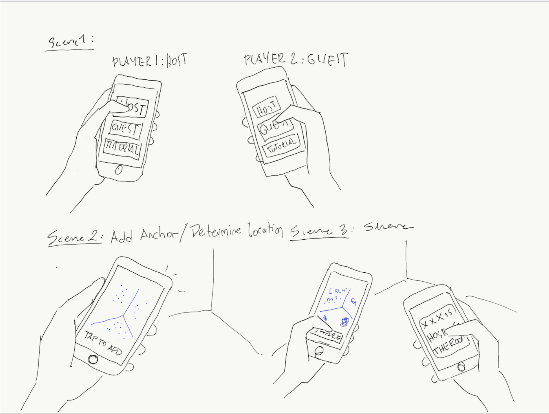
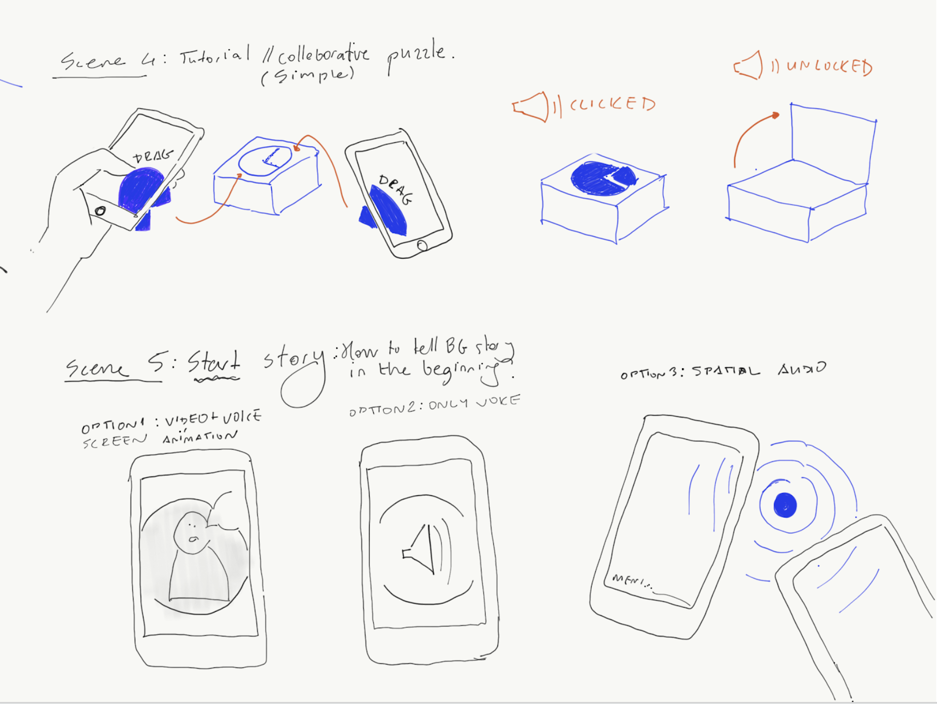
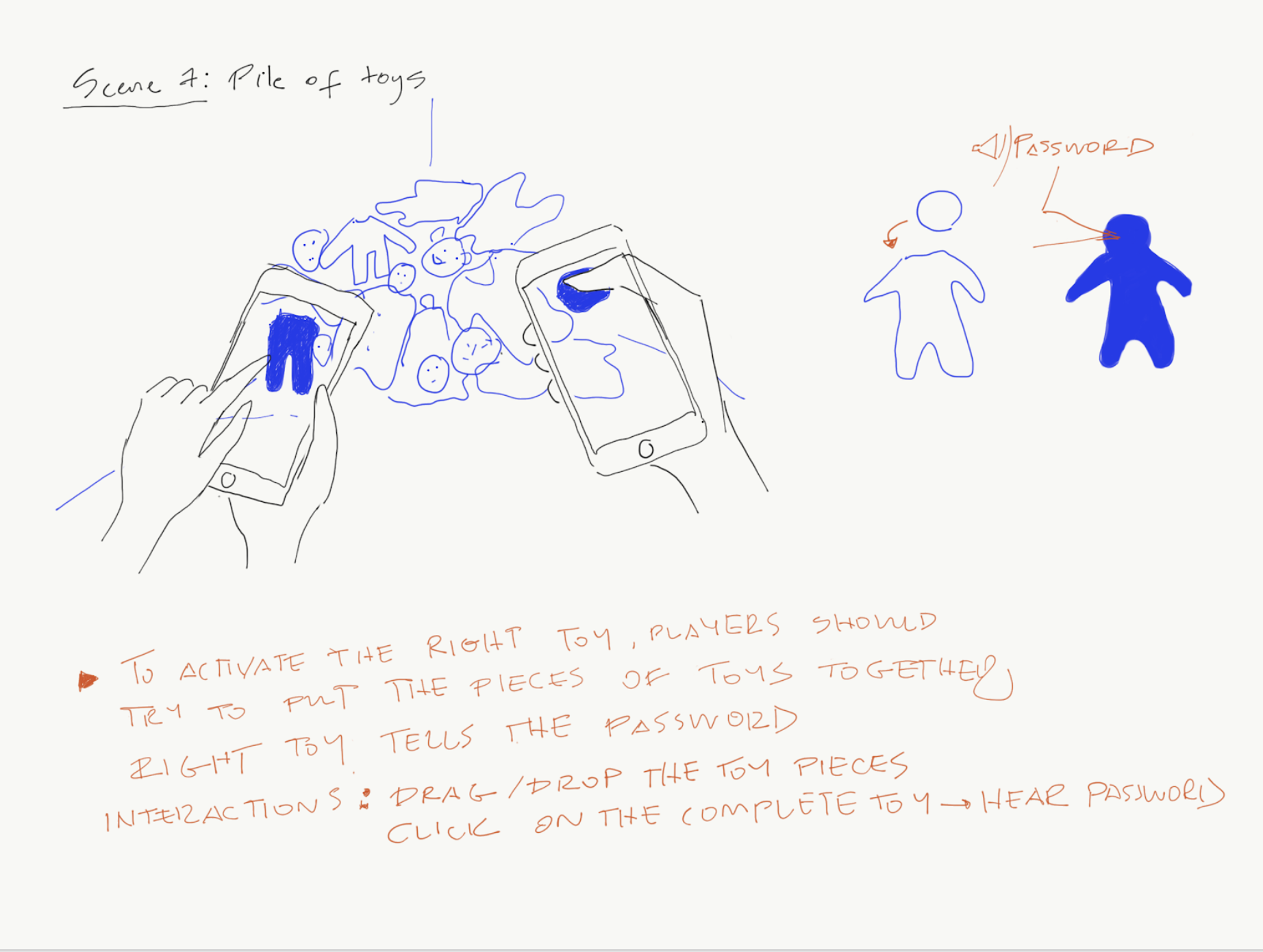
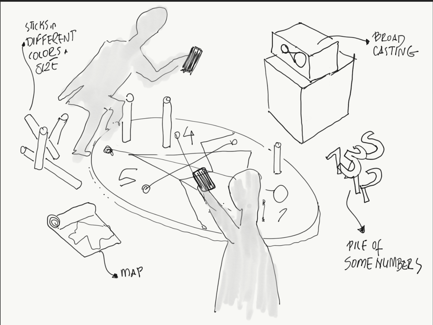
Storyboards became central to the process of determining the narrative's structure, 3d modeling needs, and the details of collaborative interactions.



IDEATE
User Flows
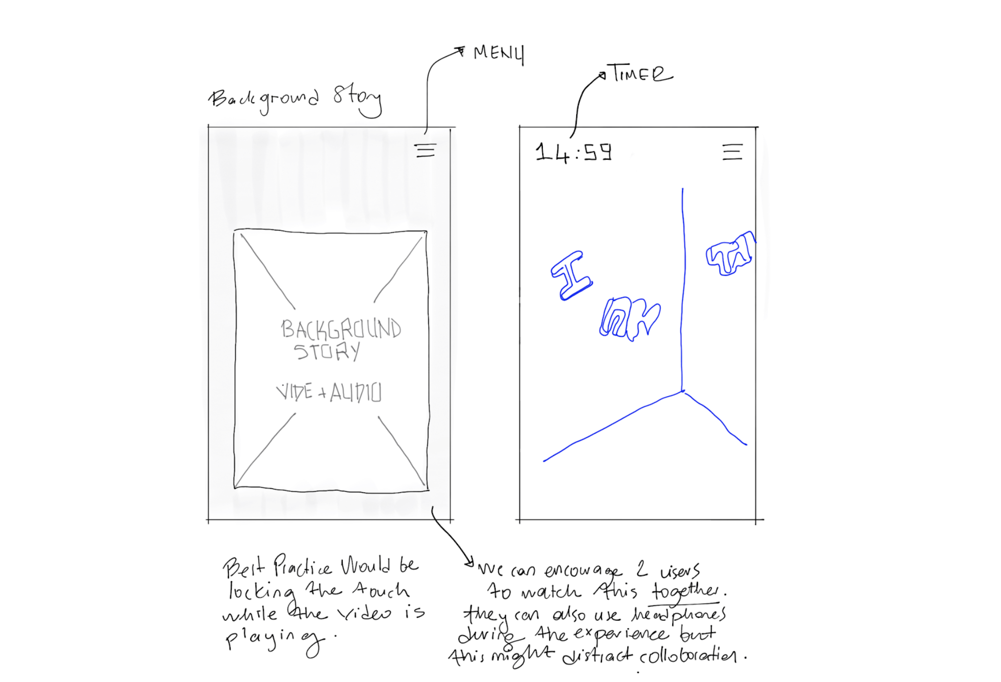
To create a usable AR experience, we needed to think through both "screen" and "scene" designs as two different but interwoven parts of user experience.
User flows were critical to design instructions that participants were going to interact with on their screen.




PROTOTYPE
Experimenting with ARKit
While designing the narrative and game's flow, we also started testing the interactions with ARKit. The technology we were using was brand new. Therefore the technical constraints were another key portion shaping the design solutions, especially while determining the interactions between digital models and multiple players.
In the following prototype, after the first user hosts the game, the other joins into the same experience. In this way, they are able to experience the same digital room together, and if one changes anything in the room by interacting, the other person can see the change too.
We mocked up smaller interactions like triggering a 3d animation and rotating certain elements in the scene by tapping on models. Some experiments were focusing on "collaboration".
We mocked up smaller interactions like triggering a 3d animation and rotating certain elements in the scene by tapping on models. Some experiments were focusing on "collaboration".


PROTOTYPE
Designing Scenes & Game Play
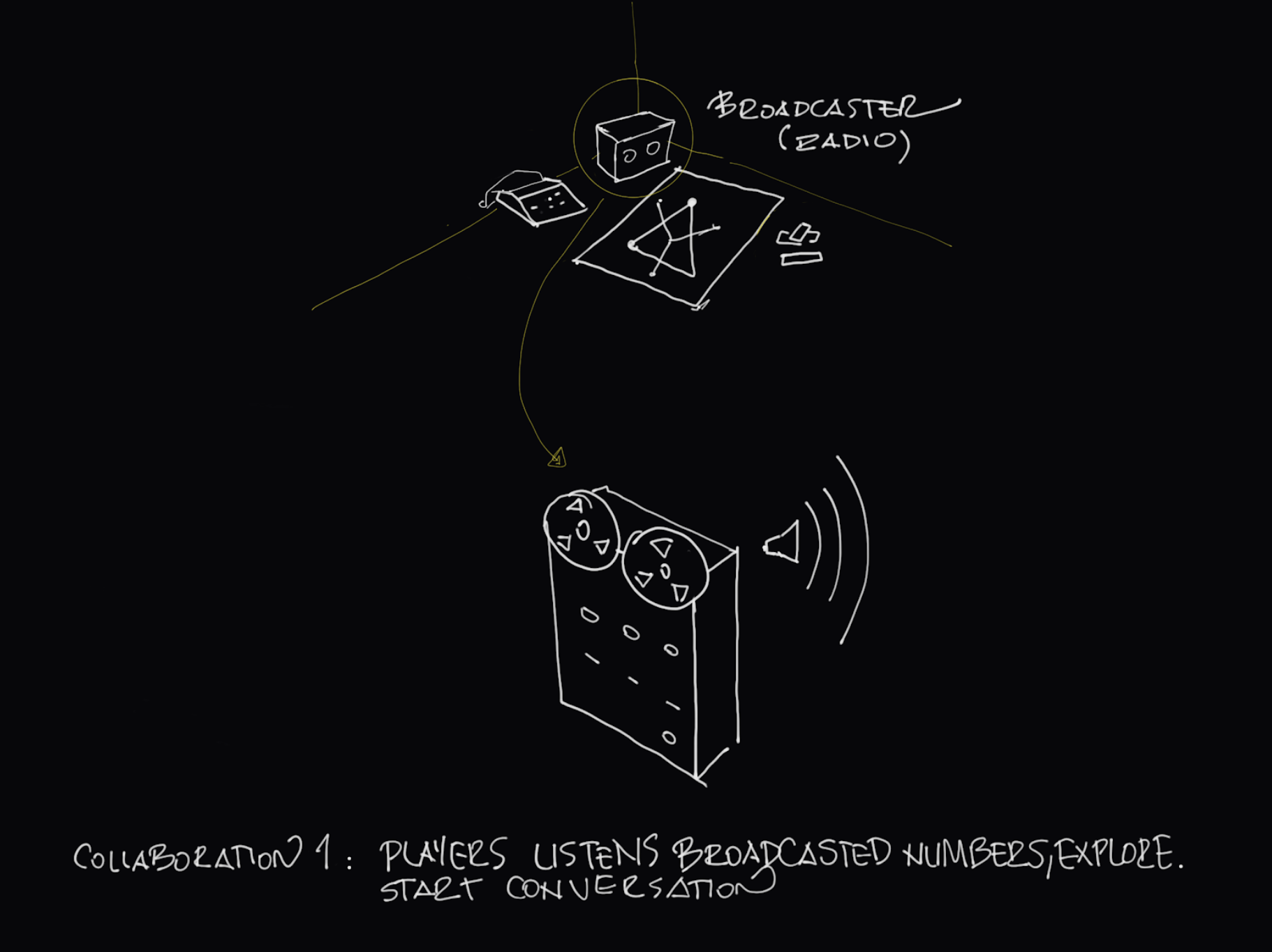


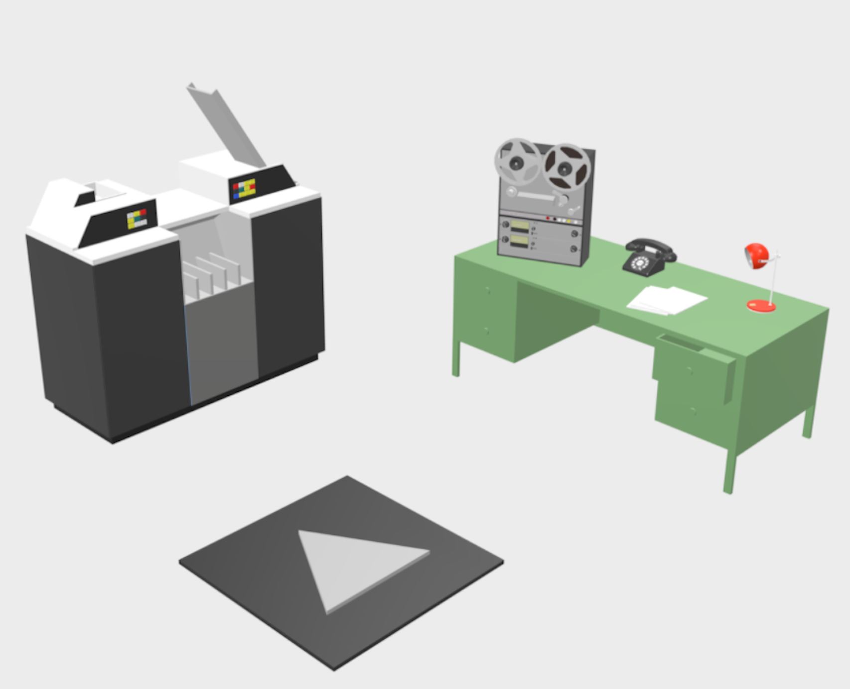
While we were testing the code for interactions, the overall experience was forming up. We decided to build an MVP version of the room. We pulled some objects from the show's era to start shaping the narrative.
1) Once both users join the room, both participants are given a background story.
"You are hired to work along with professor Hynek and Capt. Quinn to solve the mysterious UFO cases."

2) One user is tasked to activate a radio by tapping on the model through their phone. Both users would hear the cue about the first puzzle.
3) Audio cue gives them instructions and directs them to a code on the table.
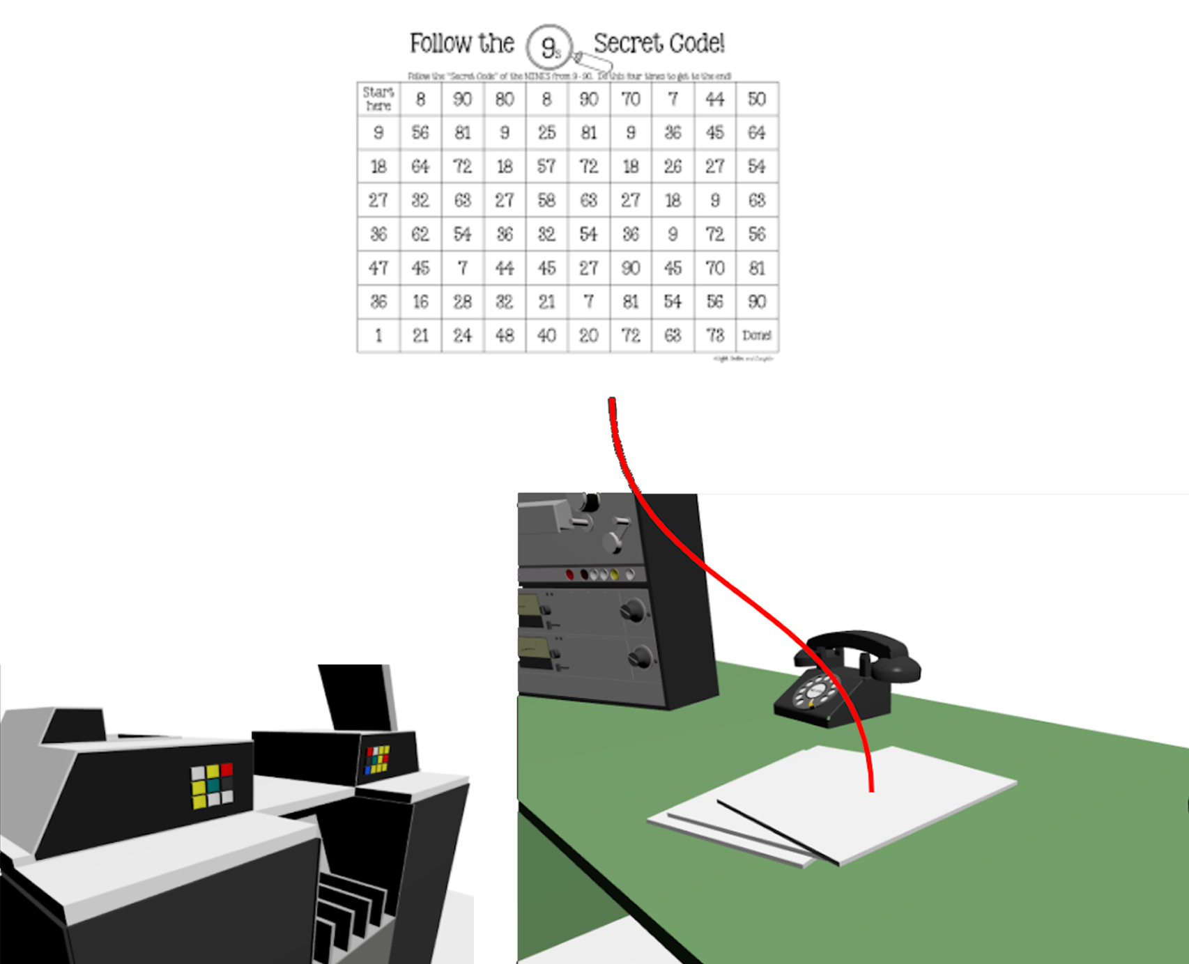
4) After they solve the first puzzle, it gives another color-clue about which buttons to press on this old fashion computer.
While one person reads the table out loud, the other was tasked to press the right combination of buttons by using their screen on the other side of the room. This portion required a natural collaboration between players.

5) Finally, by using visual clues on the punch card, they can unlock the door on the floor. This last interaction requires collaboration between players.
TEST
Playtesting at Demo Day
We tested the first iteration of our product in 2 rounds. First one was at AE Networks and second round was at the NYC Media Lab Demo Day.
Testing Findings
We had two rounds of testing for our prototype with 6 pairs in total.
1. Collaborative puzzles were hard to discover without instructions during gameplay. We needed to create more clear instructions on the screen.
2. Interactive elements were unclear because of their small sizes. They needed to be scaled up and more obviously match with people's mental models of interactive elements from the physical world.
3. There were a few bugs related to ARKit causing serious usability issues.
ITERATE
User Flows & Interactions
To clarify the relationship between participants and screen & scene interactions, we captured four key elements in each step of the new user flow:
• Hint (on the screen or scene): What type of hint do the users receive?
• Model (in the scene): Which object/3d element will be interacted with by users?
• Input: How will they interact with?
• Output: what is the outcome of the interaction?
NYC Media Lab Presentation
I work at the intersection of product, research & strategy, bringing a heavy sense of system thinking to my digital work. Currently based in New York, designing solutions at Squarespace to help people build and grow their business.
© 2022 Tuba Ozkan All Rights Reserved


